
The key to a successful business - if you ask successful businesses - is their connection with their customers.
One of the biggest questions, however, is how did they get there? How were they able to forge such powerful interest and intrigue that a consumer saw their company and said, "THAT'S what I want!".
As a business owner, branding is probably the biggest headache you've experienced once you decided to actually sell online.
Entrepreneur defines branding as "the marketing practice of creating a name, symbol or design that identifies and differentiates a product from other products."
Essentially - how you package your business together visually that stands out.
After nearly a decade of building multiple businesses and supporting thousands of entrepreneurs with their brand and marketing strategies, I can tell you without a doubt that there is one secret weapon that can create a powerful connection with a consumer almost effortlessly if utilized correctly...
And that is color psychology.
Color psychology is the study of hues as a determinant of human behavior.
This means the knowledge of how people react to color.
- When asked to rank the importance of color when buying products, 84.7% of the total respondents thought that color accounts for more than half of the various factors important for choosing products.
Source: Secretariat of the Seoul International Color Expo 2004 - Someone's initial impression of a person, environment, or product is 62-90% based on color alone.
Source: CCICOLOR - Institute for Color Research - Color increases brand recognition by up to 80 percent.
Source: University of Loyola, Maryland study -
When tested, colors help us to process and store images into memory more efficiently than black and white.
Source: May 2002 issue of the Journal of Experimental Psychology: Learning, Memory and Cognition, published by the American Psychological Association (APA) "The Contributions of Color to Recognition Memory for Natural Scenes," Felix A. Wichmann, Max-Planck Institut für Biologische Kybernetik and Oxford University; Lindsay T. Sharpe, Universität Tübingen and University of Newcastle; and Karl R. Gegenfurtner, Max-Plank Institut für Biologische Kybernetik and Justus-Liebig-Universität Giessen; Journal of Experimental Psychology – Learning, Memory and Cognition, Vol 28. No.3., 5-May-2002
If harnessed with good intentions, this could be the biggest tool you've ever had in your branding arsenal.
Remember, branding is the process of building a visual identity. A key part of visuals is color, right?
Connecting how people feel when exposed to certain colors gives you the ability to further that connection and solidify it in their minds as something they can trust.
For example, the color blue is often associated with trust and reliability, while red can evoke a sense of urgency or passion.
By strategically incorporating these colors into your brand's visual identity, you can influence how your target audience perceives your brand and establishes a connection with it.
We will also discuss the importance of consistency in color usage across various brand touchpoints, from your logo and website to your packaging and marketing materials.
In this article, I will show you exactly how to harness the power of branding in your business so that you can connect emotionally with a consumer, prompting them to become a customer more quickly than traditional marketing efforts.
You will also see:
- Successful brands and how they've utilized color choices
- A breakdown of each major branding color and its meaning
- Advice on how to utilize color psychology in your brand strategy
The Evolution of Color Psychology in Branding
The history of color psychology in branding is a mesmerizing journey through time, exploring the profound influence of colors on human perception and emotions.
In the annals of history, the year 1704 marked a pivotal moment when Sir Isaac Newton unveiled his groundbreaking discovery – the color spectrum. From this revelation emerged the color wheel, adorned with what would later be recognized as the "original seven colors." Newton documented his findings, the color wheel, and his contemplations on the potential effects in his seminal work titled "Opticks."
Fast forward nearly a century, and we encounter the contributions of Johann Wolfgang von Goethe. In 1810, Goethe authored the influential "Theory of Colors," derived from his personal observations and reflections on the nature of colors. This pioneering work expanded the realm of color understanding.
Transitioning into the early twentieth century, the eminent psychiatrist Carl Jung embarked on an exploration of the profound impact of colors on the human psyche. His research laid the foundation for future endeavors and ultimately led to the development of the well-known Myers-Briggs Personality Test, which delves into the intricate interplay between personality traits and color preferences.
While history offers a treasure trove of wisdom, the world of color psychology continues to evolve and unfold. In the realm of branding, we have a unique canvas for understanding and harnessing the emotive and psychological effects of colors. The journey of exploration and discovery is ongoing, and the potential applications of color in branding are as boundless as human imagination.
Join us as we dive deeper into this vibrant world, unearthing the endless possibilities and illuminating the path to more effective and resonant branding through the art and science of color.
Color Psychology Of Red
![]()
Red is one of the most popular colors in branding because it's a psychological primary color - one that most strongly affects the body.
This is why most news channels, sports teams, and even political parties are red.
Red increases heart rate, blood pressure, and pupil dilation, making the body react.
Brands choose this color to get people's attention. They know people will see it - just like a red car is most likely to get the attention of a police officer when speeding.
It's the first color we see in the visible light spectrum and has the longest wavelength.
Depending on the undertone of the color, Red can say "danger," "pay attention," "love," or even "get angry"!
- For example, the American Red Cross is red as they are most commonly associated with medical aid and blood donations.
- H&M, on the other hand, is trend-forward fashion and wants to be seen as the cutting edge.
- Nintendo is a stimulating red to get the attention of kids and gamers.
- Whereas CNN wants to be seen as the world's leading news authority.
Funnily enough, however, a large degree of the population cannot see red. 8% of men have a chroma deficiency that affects the red/green wavelengths of light - that's 1 out of every 12 men. It affects women too, with 1 out of every 200 not being able to see the color.
So, if your audience is predominantly male, this is not the best advertising color to use to get their attention because they will see brown.

When to use the color:
- If you are primarily seeking customers in countries like the United States, United Kingdom, Canada, etc., you can use this color to connotate passion and love.
- This color will also alert an audience to potential danger, so if you advocate for heart health or want to educate people about CPR, red could be a great branding color.
- If you're selling a product that will make someone more attractive, red could be the best choice. People who wear red or are redheads are perceived as 30% more attractive!
When to avoid the color:
- If your audience has suffered trauma or has PTSD, this is the color to avoid the most. They will feel very triggered and aggressive in red's presence.
- Depending on the country, red could have very different connotations than what you're used to. For example, Russia, Africa, and China have very different meanings of red in their cultures.
- If you're seeking customers who are more democratic, they might naturally have a more negative charge towards red.
As you can see, there is no "one perfect formula" for a type of business and a brand color. It varies depending on a lot of factors.
The bottom line for red is to study it with your ideal client base. See how they respond to it. Test different types of red to see what they positively respond to the most.
Remember, you are looking for a primary color that will most quickly touch a consumer's emotional state of their biggest need.
So, if they need passion, action, excitement, or artistic expression -- red might be a great choice in brand color for you!
Color Psychology Of Orange
![]()
Orange is, let's face it, probably the least-chosen brand color worldwide.
But it can be one of the best colors to choose to represent your business and attract your customers!
Orange's use throughout history has given it a bad rap. From clowns to prison uniforms to traffic cones, people generally are most repulsed by this color.
Did you know that orange is the most crucial light spectrum color to help us wake up?
Or that it helps the body achieve balance in its energy?
Brands choose orange to get noticed but in a more stable way than red. It says "hello" instead of "HI"!
It's the second color we see in the visible light spectrum and is most crucial in the morning to help us produce the hormones to wake up well.
Depending on the undertone of the color, Orange can say "caution," "family," "youth" or even "stability"!
- For example, Home Depot uses orange to be seen as the workhorse of construction with reliability.
- Payless, however, utilizes orange to signal lower prices and affordability.
- Fanta's brand is a brighter orange to showcase youth, fun, and freshness.
- Whereas Hooters uses orange to signal curiosity and an entertaining poke at crassness.
Orange has some of the most polar opposite meanings of colors that I've ever experienced in my research.
Where else could it symbolize spirituality and reverence in India, energetic patriotism in Denmark, and Halloween in America?
This color has to be used with discernment and intelligence depending on where you're advertising and how people culturally relate to the color.

When to use the color:
- If your brand seeks balanced wellness, like Noom.
- When your audience ties it with reverent spirituality and loves the color association with your products.
- If your brand focuses on youthful entertainment.
When to avoid the color:
- If your audience has a history with prison.
- Depending on the country, orange may be a poor choice. Be sure to look into the countries that account for most of your sales to make sure they have good reactions to the color.
- With skincare, fashion, or makeup - use orange with caution. Very few people look good in orange - about 15%. If you are going to use it on someone's body, be sure to invest in a color analyst who can help you choose the right shades so it looks attractive and balanced.
Orange is a cautionary creature that can dramatically change a brand - for its explosive growth or quick demise. As with all colors, it depends on the messaging.
If you decide to use orange, test many different shades to make sure you find the perfect one!
When you do, you'll know!
When we test final color palette choices, one always wins by at least 60%, so don't be afraid to bring in your audience. They will love to help!
If they need balance, energy, family, or entertainment - orange might be the perfect fit!
Color Psychology Of Yellow
![]()
Yellow is a color that gets your attention - there's no doubt about that.
It's also a psychological primary color and specifically causes a reaction in the nervous system.
This is why it's the color on most caution signs and the light signal that tells us to slow down for a stop.
Yellow stimulates lymphatic flow in the body and causes the most peak excitement the eyes are capable of experiencing. This is why it's a colorblind, safe color!
It's close to the middle of the visible light spectrum and a color we're exposed to most of the day. Did you know studies have proven that if you expose your eyes to natural sunlight for at least 30 minutes before going out for the day - the risk of sunburn goes down substantially? The light signals the body to create the protection it needs for the specific rays of the sun that day. Incredible.
Yellow makes us pay attention, express positive feelings, and prepare for what's coming.
Depending on the undertone of the color, Yellow can say "caution," "joy," "invigoration" or even "yum"!
- For example, McDonald's gets kid's attention and makes them yell from the back of the car to take the next exit.
- Post-it uses yellow to invite focus and write the next to-do down on paper.
- Ikea's yellow logo makes us want to go have fun shopping with the whole family.
- Whereas Best Buy is seen as the cutting edge of electronic technology.
The biggest caution with yellow is if your audience has any kind of neurodivergence. If they have ADD, ADHD, Autism, or anything in this family - yellow may be way too stimulating for them.
They may potentially feel overstimulated, stressed, or even angry, seeing too much yellow.
If you still need to use the color, dilute it with black or gray to lessen the reaction.

When to use the color:
- If you want someone to feel energized, excited, and joyful in your brand experience.
- To connotate youthful feelings and hope for the future - people will feel more optimistic in a yellow environment.
- In test-taking scenarios. Studies prove people score higher on tests when exposed to a bit of yellow beforehand!
When to avoid the color:
- If your audience has neurodivergence or predominantly associates this color with caution.
- Depending on your ideal client, make sure they aren't overly exposed to yellow. Joy can quickly turn to anxiety if there's too much yellow every time they see you or your product.
- If you're the face of your brand, make sure you look good in the color. If not, your brand photos may be a frustrating experience, and that energy will carry over into your website and social media.
Yellow is an abundantly wonderful color...but in smaller doses.
In most designs - either website, brand photos, or stock photos - it's always a good idea to support yellow with lots of whitespace colors and neutrals.
Give yellow the room it needs to do its job - which is to stimulate the pineal gland and help people see themselves differently in the future.
Remember to use it with intention and focus. Find the color as much texturally as you can (like in the images above) to get the feeling across but in a relatable environment.
If your consumer needs brightness, hope, and excitement - this could be the best color to use!
Color Psychology Of Green
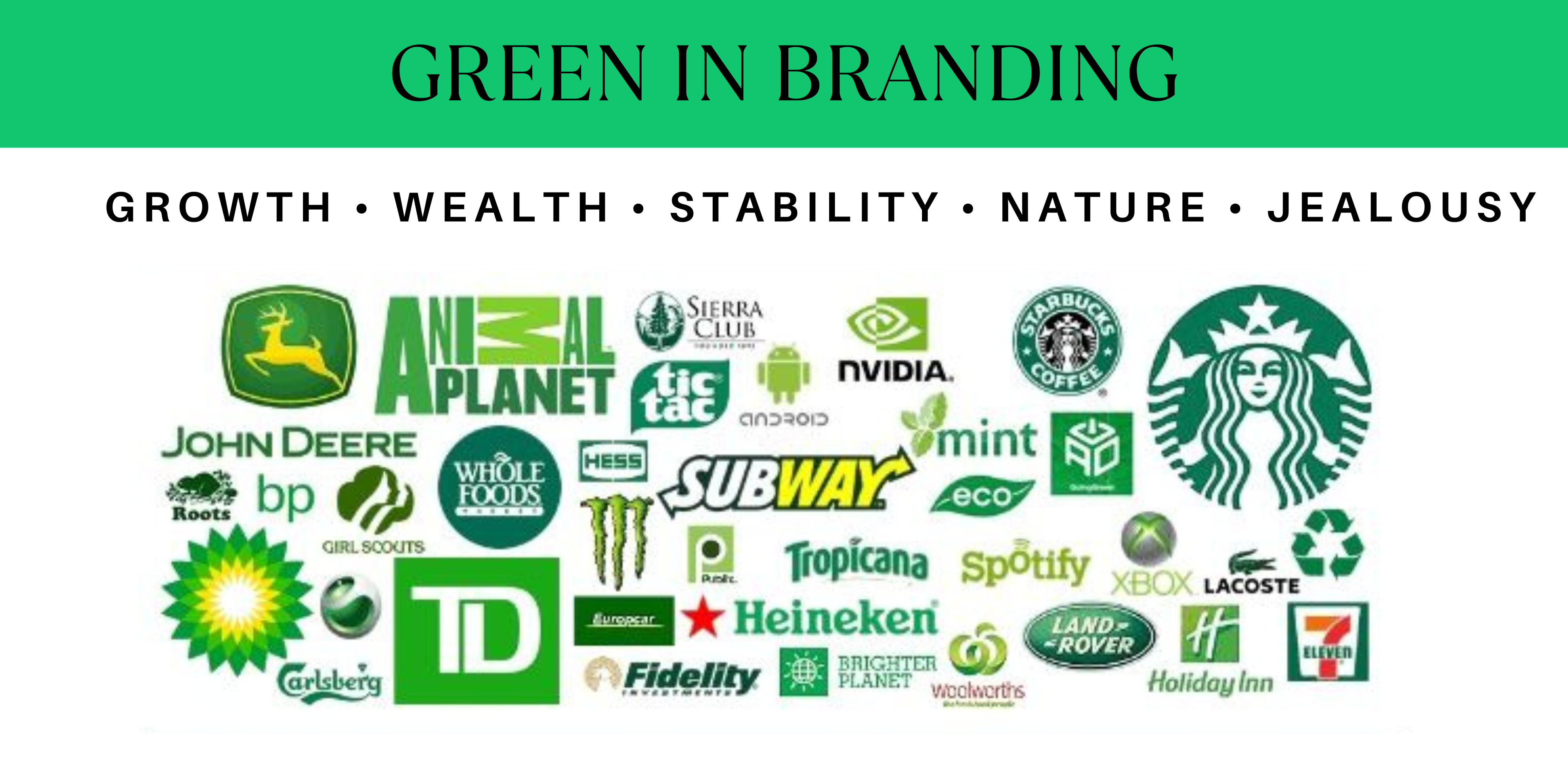
Green is one of the most widely used colors that stays very aligned in its meaning. It doesn't sway too much in terms of good or bad potential reactions.
This is why most health, finance, drink, and practical daily habit companies use the color.
Green is another psychological primary color that stabilizes all the others. It's grounding, stable, and feels good to most people.
Brands choose this color to make people feel good. They know people will feel more at peace in an orange environment and possibly feel like they're making a choice that is good for them overall.
It's smack dab in the center of the visible light spectrum and has the most shades of any color. This is why nature is mostly green and has so many varying shades to choose from.
Depending on the undertone of the color, Green can say "growth," "wealth," "jealousy," or even "identity"!
- For example, Starbucks has become a daily habit, with its logo being the most recognized in the entire world.
- Animal Planet wants us to feel tied back to nature.
- Land Rover wants us to explore the world.
- And Whole Foods shows us that they're the healthiest shopping choice (potentially!).
Green is another color that can be hard to see for those with chroma deficiencies. People may mistake green for brown or even dark blue.

When to use the color:
- If you are primarily seeking customers in countries like the United States, United Kingdom, Canada, etc., you can use this color to connotate growth, health, and wealth.
- Ireland does have a very special affinity to green based on its history, so don't disrespect it accidentally.
- This color will make someone feel more adventurous and explorative - so brands that want this effect should lean into the color wholeheartedly.
- If you're selling a product for freshness, like a detergent, soda, or cleaning product, stick with a light green! Think Gain detergent, Sprite, or the Grove Collective.
When to avoid the color:
- If your audience grew up with the wicked witch in The Wizard Of Oz - be careful with emerald green. They may not trust you or worry about bad intentions. It's true!
- Since there are so many potential color choices, be intentional. Test to make sure someone isn't thinking of spoiled meat or an evil potion when they see your brand color.
- Evil is most tied to this color, so just be aware. If you're a financial company, be very clear in your messaging and imagery that you put the customer first so they can overcome any barriers they may have with green.
As you can see, there are so many fun options with green that make it a delightful color to experiment with. It's very easy to add a warm or cool base and completely change the feelings people experience.
The bottom line for green is to get very clear in cool and warm tones. It's easy to cross over and confuse your messaging. Make a clear choice!
Remember, your goal is to draw your consumers in so they know you're the perfect fit for them just by seeing your primary color!
So if they need stability, growth, wealth, or a stronger self-identity -- green might be a great choice in brand color for you!
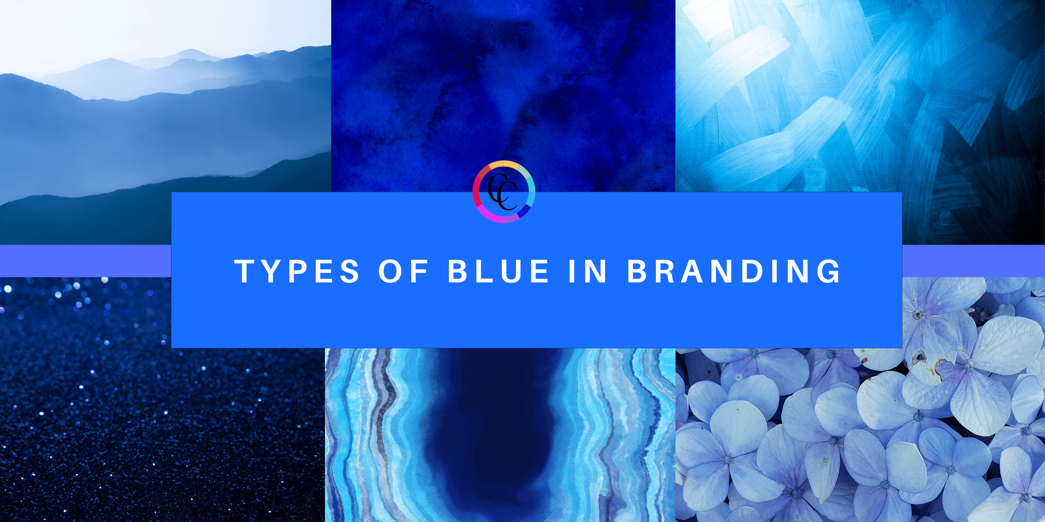
Color Psychology Of Blue
![]()
Blue is the other most popular color, if not THE most, in worldwide brands because it's another psychological primary color that most strongly affects the mind.
This is why most news channels, sports teams, tech companies, and even political parties are blue.
Blue decreases heart rate, blood pressure, and pupil dilation - it makes the body calm its reactions.
Brands choose this color to gain people's trust. They know people will see their brand as more authoritative and trustworthy. Most, sadly, exploit this.
It's a shorter light spectrum color, but one we see all throughout the day when the sun is up.
Depending on the undertone of the color, Blue can say "calm," "trust me," "think about it" or even "depressed"!
- For example, LinkedIn uses blue to show its authority in more professional connections.
- Paypal wants your trust with your money for transactions.
- Walmart's goal is to bring calm and security to your shopping experience.
- Whereas NASA wants you to come along on the journey of space travel.
Most people can easily see blue. Your dog can, too!
It's very calming to the eye and encourages retrospection, deeper thoughts, and an easier time learning new information.
When to use the color:
- If you want your customers to be more mentally stimulated when they first see your brand - this is not for brands where you want them to feel emotionally or physically.
- To create calming, trusting reactions.
- If you're selling a product that will make someone's life easier through technology, this may be the best choice.
When to avoid the color:
- This color sways in meaning depending on the shade. The deeper the color, the deeper and introspective the mind will react. The lighter, the more light-hearted it will feel.
- If the new mental process/learning that you're teaching is very polarizing. If there's too much blue, there may be pushback because the color will keep someone in their head and in no way be connected with their feelings.
- If you're seeking customers who are more Republican, they might naturally have a more negative charge towards blue.
Blue is interesting as it's the second most found color in our environment. It's in the sky and in the water, but it creates the biggest reaction in the mind.
The bottom line for blue is to find the right shade that will cause the reaction you're going for. You can see the cobalt blue I'm wearing in the image below. It's focused on learning something new but in a fun way. That's why the color choice is so bright.
If your audience needs trust, authority, calm, or deeper thinking -- blue might be a great choice in brand color for you!
Color Psychology Of Purple
![]()
Purple can be the most challenging color in every way!
Why? Because people can be very unsure of purple.
Purple can make you feel contemplative, royal, reflective, spiritual and even mystical. But it can also make you out of touch with reality or come across as cheap.
Purple is an extremely strong color choice to work with, but it ultimately allows people to connect - with themselves or with others.
Purple on the visible light spectrum is actually violet and is created by combining red and blue.
The purple we know and love was man-made!
Depending on the undertone of the color, Purple can say "mystic," "spiritual," "connection," or even "royalty"!
- For example, Curves uses purple to deepen the self-acceptance of women going through their program.
- FedEx uses purple to grow our trust in them delivering our packages - to become our "go-to" shipping source.
- Hallmark is all about relationships, right? Of course, they would lean purple in their branding!
- Whereas TacoBell rebranded a few years ago to purple to lean fully into mysticism with Doja Cat as their spokesperson.
Purple is the color people tie most to spirituality, much more actually than the noble or royal.
So, if your audience is more mystical, this could be a great color.
Or, if you want people to grow their connections in some way - this could also be a great color choice!

When to use the color:
- If you are primarily seeking customers with more of an open mind. They will understand your intentions with the color easily and feel very quickly drawn to it.
- This color can prompt transformation (the most common use for purple used in the film), so if you want to signal transformation, give purple a try!
- If you're selling a physical product and want it to feel elevated and rich, purple is a great choice.
When to avoid the color:
- If your audience is an older generation or is very traditional, avoid this color at all costs. It will be seen as too "out there" and will turn customers off.
- Purple is generally accepted worldwide and, in some cultures, like Japan, is very highly valued. Make sure your messaging aligns with the countries you're advertising to.
- If you're seeking customers who have broken relationships to bring restoration, try purple, but with blue undertones and NOT red.
As you can see, purple is very different in how it causes people to react and makes us feel much more spiritual as it's the last color in the visible light spectrum, having the shortest wavelength.
The bottom line for purple is to prepare for a much more spiritual reaction - no matter what you're selling.
If your consumer needs connection, spirituality, or enhanced status of self -- purple might be a great choice in brand color for you!
Color Psychology Of Pink
![]()
Pink is a color I avoided talking about for a long time because it does not live in the visible light spectrum. It's a manmade color - a combination of red and white.
I couldn't prove scientifically that it caused a measurable reaction in the body. At least, so I thought!
Person after person reached out, saying pink was absolutely blowing up their business model and exciting their customers.
I spent about six months digging into every study - and being a part of a new one!
Pink gained a lot of notoriety in WWII. Warships, jeeps, and even planes were painted pink so they would more easily disappear in eyesight on the far horizon.
Later, an admittance cell to a jail was painted pink to gauge people's reactions. It subdued heart rate and agitation for up to 30 minutes!
Pink subdues heart rate and behavior in people when in the environment of the color.
Brands choose this color to signal fun, comfort, and femininity. They understand how people will respond and use it well within the context of their brands.
Depending on the undertone of the color, Pink can say "fun," "youth," "comfort" or even "hungry"!
- For example, Baskin-Robbins wants you to be hungry and ready to fill your belly with ice cream!
- Pink by Victoria's Secret is the youthful, young, and often comfy brand that Victoria's Secret has for its younger customers.
- Little Words Project wants to connect its audience to new, fun ways to spread kindness and support through the world!
I was fortunate to work with The Knotts Churros in the United Kingdom on a piece covering pink. This was their signature brand color, and they wanted to know the stats on pink.
There weren't many! So they actually worked with Censuswide, polling over 2,000 British people to see how they felt about pink.
- Pink tops the charts for Brits’ top-tasting colors, with 82 percent saying it evokes feelings of joy and 49 percent feeling more energized.
- 76 percent of people surveyed even reported a significant energy boost if a restaurant used a pink colour palate than those that didn’t.
So, if your audience is predominantly female or youthful, this may be a great color to consider.

When to use the color:
- If your audience needs some fun, playfulness, and youth - they'll love this color!
- Desserts! As we've seen, people love pink in a desert environment.
- If you're selling a beauty product specifically geared towards females, they will be more naturally drawn to this color palette.
When to avoid the color:
- If your audience will be triggered by "norm" standards of femininity, avoid this color.
- Three words: The Barbie Movie. We're going to be facing some pink exhaustion, so note if your audience has Barbie fatigue!
- If latent aggression could become an issue. When inmates were exposed to pink for more than 30 minutes, they became more aggressive. This is most likely because a mixing color of pink is red.
It's important to note that pink is primarily used as an indicator of evil, vanity, or vapid personality in film. As it's so prevalent in movies throughout the last 50 years, take it into consideration when using pink.
Pink is a fascinating color with the most complex history.
Be sure to grab my book Color Secrets to learn more about it, as I'll give you all of the history I didn't have room to list here! A fun aside is that most men who read it become huge fans of pink!
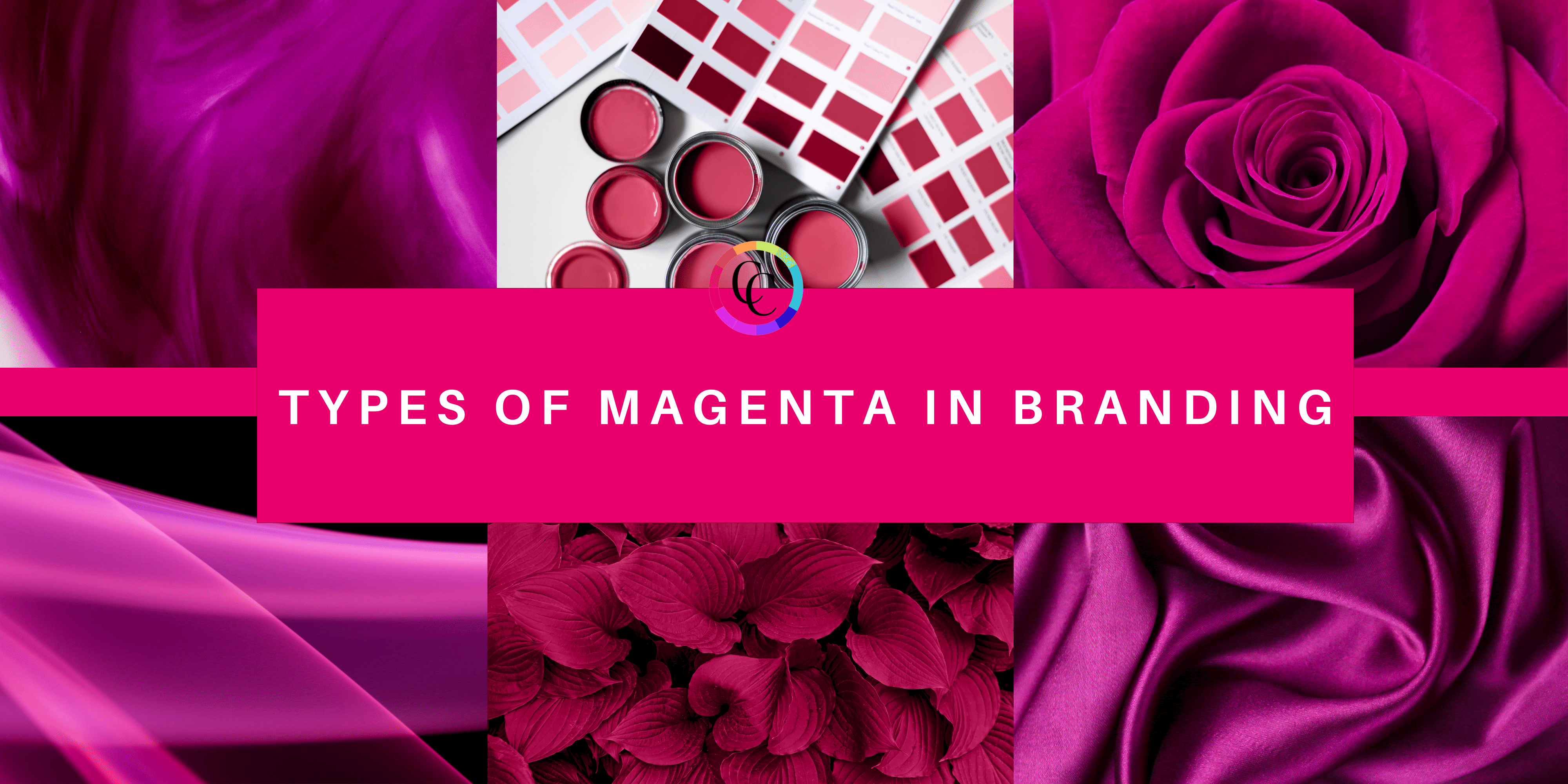
Color Psychology Of Magenta
![]()
Magenta is the most controversial color in the world.
This may be why Pantone chose it as 2023's color of the year.
Magenta is all about revolution and boldness.
Brands use this color to get people's attention and showcase a new way of thinking or a new lifestyle.
It is not within the visible light spectrum - yet it is a combination of red and purple. Technically, our brains make up the color...
Depending on the undertone of the color, Magenta can say "bold," "revolution," "innovation," or even "politically charged"!
- For example, T-Mobile not only uses the color but has trademarked its shade as they are a wireless phone "uncarrier".
- Cosmopolitan is very controversial and uses magenta to support its message of unconventional topics.
- Some say Barbie is magenta, but it is actually hot pink!
Magenta wants to be noticed, wants to push you to the edge of your comfort zone, and wants to cause agitation.
It is the only color that doesn't vary much in meaning.
When to use the color:
- If you want to incite energetic action and a push for change.
- This color will also cause an audience to push for revolution in whatever industry you are leading.
- If you're selling a product, that will make someone feel more bold and rebellious.
When to avoid the color:
- If your audience was of age in the Reagan era. They may have a negative association with the color due to it being used for the "Rock Against Reagan" concert series.
- Depending on the person, magenta can be too much. It will cause agitation, so make sure that isn't a possibility with your customer base.
- If your customers have an issue with political or gender evolutions. They will subconsciously tie the color to those topics and steer clear.
Magenta is a powerhouse color that can either blow up or break a brand.
The biggest choice with Magenta is to choose either a stronger red or purple leaning as they will mean two different things. Purple base - more relational and about self-identity. Red base - more boldness and revolutionary actions.
If you know this is your perfect brand color, go for it! People will definitely respond!
Black, white, gray, and brown in branding: The understated power of neutral tones
When it comes to branding, the spotlight often falls on vibrant and emotive colors like red, blue, and green. However, there's a quiet strength in the understated neutrality of black, white, gray, and brown. These non-emoting colors may not evoke strong emotional or mental reactions, but they play a vital role in complementing and grounding the more expressive hues. Let's delve into the significance of each of these neutral tones in branding:
Black: Elegance and sophistication: Black signifies elegance and sophistication. It's a timeless color that conveys a sense of luxury and prestige. In branding, black is often used to create a sense of exclusivity and style. Brands like Chanel have successfully harnessed the power of black to become synonymous with high-end fashion.
White: Purity and simplicity: White represents purity, simplicity, and cleanliness. It's a color associated with minimalism and can convey a sense of honesty and transparency in branding. Brands that aim to highlight the simplicity and purity of their products often use white, such as Apple's clean and minimalist designs.
Gray: Balance and neutrality: Gray is a color that strikes a balance between black and white. It's often used to convey neutrality and impartiality. In branding, gray can help create a sense of professionalism and reliability. It's a color that doesn't overwhelm but instead provides a stable backdrop for other more vibrant colors to shine.
Brown: Warmth and earthiness: Brown is often associated with earthy tones, warmth, and reliability. It's a color that can evoke feelings of comfort and stability. In branding, brown is used to connect with nature and the environment. Companies focused on sustainability and natural products often use brown to convey their eco-friendly values.
The role of neutral tones in branding: These non-emoting colors may not trigger strong reactions, but they serve as essential supporting elements in branding. They provide balance, contrast, and context to the more emotive colors. They can enhance the impact of other hues and make the overall brand identity more versatile.
In conclusion, The power of black, white, gray, and brown in branding lies in their ability to ground, support, and enhance the more expressive colors. While they may not elicit strong emotions, they play a crucial role in creating a well-rounded brand identity. Whether it's the elegance of black, the simplicity of white, the neutrality of gray, or the warmth of brown, these neutral tones are the unsung heroes of effective branding.
Color and Brand Trust
In the captivating world of branding, color emerges as a masterful influencer, wielding the extraordinary ability to shape trust. Yes, you heard it right. The choice of color isn't merely a visual preference; it's a strategic art that can craft an image of trustworthiness in the minds of consumers.
Unveiling the Power of Color: The pivotal role of color in building brand trust lies in the deep well of associations and emotions it evokes. Every shade and hue is a brushstroke in the portrait of your brand, capable of forging profound connections with your audience.
A Symphony of Emotions: Take, for instance, this survey by Performable, which revealed that the color blue, often synonymous with trust, significantly elevated trust ratings among participants. These statistics underline the substantial influence of color psychology on branding—it's arguably the cornerstone.
Beyond Aesthetic Whims: Gone are the days when color choices were arbitrary. They now carry the weight of proven impact on consumer behavior, brand recognition, and the triumph of marketing endeavors. Businesses can't afford to overlook the psychology behind colors when crafting their brand narratives.
Consistency as the Beacon of Trust: A brand's commitment to consistency in its color palette is like a shining beacon in a sea of choices. It signifies dependability, professionalism, and a steadfast dedication to a unified image. This visual consistency reinforces the brand's core values and mission every time it meets the eye.
Bridging Cultures: The importance of color transcends borders. When crafting a global brand, understanding and respecting cultural color meanings can be the key to creating trust among a diverse audience. It's not merely about what you say but also how you say it through your brand's color language.
First Impressions, Lasting Impact: In the blink of an eye, you need to make a lasting impression. Just as in the physical world, the colors you wear can convey messages about who you are; your brand's colors are your first words in the language of trust. Ensure that you're speaking the right language.
In the grand tapestry of branding, color is the brush that paints an indelible image. Harness this powerful tool, unlock its potential, and watch as your brand is etched into the hearts and minds of your audience - leading to faster memorability and increased engagement percentages. Every shade and every hue is an opportunity, and trust is the masterpiece that can emerge when you paint your brand's story with the right colors. In the world of branding, the choice of color is not a matter of chance; it's the vital brushstroke that can create an enduring impact.
Brands That Utilize Color Psychology
![]()
Coca-Cola®
In the colorful world of branding, Coca-Cola® stands as a prime example of how the strategic use of color can redefine an industry. With its vibrant and unapologetic red branding, Coca-Cola has etched a lasting imprint on the consumer psyche.
They currently sell 1.9 billion bottles of the beverage per day!
A Captivating Hue: Red, the heart and soul of Coca-Cola®'s branding, isn't just any color; it's a vibrant symphony of emotions. This bold choice goes beyond aesthetics, serving as a powerful emotional trigger. It ignites excitement, passion, and energy in the minds of consumers. When you think of Coca-Cola®, you're transported to a world of unadulterated enthusiasm.
The Art of Attention: Red, as the brand's cornerstone, ensures that Coca-Cola® doesn't merely blend into the backdrop; it demands attention. Its magnetic allure grabs your senses, setting the stage for an unforgettable experience. It's the color that beckons you, promising a good time and a refreshing sip of happiness.
The Face of Fun and Happiness: Beyond a mere beverage, Coca-Cola® is synonymous with the essence of fun and happiness. Its red branding doesn't just represent a product; it embodies a lifestyle. It's the color that speaks of shared moments, celebrations, and the joy of being alive. When you think of Coca-Cola®, you think of an effervescent journey painted in vibrant shades of red.
A Timeless Connection: Over the decades, Coca-Cola®'s red branding has transcended generations. It's the timeless thread that binds the past, the present, and the future. This iconic color serves as a reminder that some experiences are eternal, and some brands become a part of our very identity. Coca-Cola®, in its red glory, isn't just a beverage; it's a testament to the enduring power of color in branding.
In essence, Coca-Cola®'s use of red goes far beyond being a choice; it's a declaration. It declares that moments of happiness, shared with a Coke, are moments that etch themselves in the heart. It's a testament to how the strategic selection of color can evoke emotions, inspire energy, and turn a brand into a timeless legend. In the world of branding, Coca-Cola®'s red isn't just a color; it's a promise of joy wrapped in an inviting hue.
![]()
Facebook, a global giant in the realm of social media, has strategically harnessed the psychology of color to create an indelible brand identity. At the core of Facebook's visual persona lies the color blue – an unassuming yet powerful choice that delves deep into the psyche of its users.
The bedrock of Trust: Facebook's unwavering commitment to blue as its primary branding color is a bold proclamation of trust and dependability. Blue, in the realm of color psychology, is synonymous with stability and security. It invokes feelings of reliability that are of paramount importance in the digital age. As users scroll through their news feeds and interact with friends and family, the calming presence of blue reassures them that their personal moments are guarded.
A Haven of Security: In an era defined by privacy concerns and data security, the choice of blue as Facebook's backdrop is not arbitrary but deeply thoughtful. It transforms the platform into a haven of security, akin to a digital guardian. Blue signifies a dependable friend, someone you can trust with your thoughts, photos, and memories. It's the color that silently but powerfully communicates that the sanctity of personal moments is a sacred commitment.
The Blue Powerhouse: The strategic use of blue in Facebook's branding isn't just about aesthetics; it's a profound statement of intent. It underlines the company's dedication to its users' trust and peace of mind. As the digital landscape becomes increasingly complex, the choice of blue emerges as a powerful psychological cue. It says, "You are safe here," fostering a sense of confidence and comfort among Facebook's billions of users.
A Universal Language: Facebook's blue transcends linguistic and cultural barriers. It's the universal language of trust, a silent promise of security understood by users across the globe. In an age of digital interconnectedness, it stands as a symbol of reliability, a color that welcomes users from diverse corners of the world to share their stories and connect with one another.
In the ever-evolving digital universe, Facebook's deliberate use of blue is a testament to the profound impact of color psychology in branding. It's a reminder that, in a world of algorithms and data, a single color can evoke feelings of trust, security, and a sense of belonging. Facebook's blue is not merely a color; it's the reassuring embrace of the digital era, inviting users to share their lives with confidence and peace of mind.
![]()
McDonald's®
McDonald's®, the fast-food giant that has left an indelible mark on global culture, has masterfully wielded the psychology of color to craft an iconic brand identity. At the heart of this identity lies the color yellow, a choice that resonates deeply with the essence of the brand.
The Radiance of Happiness: McDonald's®'s bold and pervasive use of yellow is nothing short of a beacon of happiness. This color is a jubilant symphony, evoking joy and warmth. It's the embodiment of smiles, laughter, and the simple pleasures of life. For anyone who has ever stepped into a McDonald's, yellow is the vivid backdrop to moments of pure delight.
A Burst of Enthusiasm: Yellow isn't merely a hue; it's an electrifying burst of enthusiasm. McDonald's® has ingeniously harnessed the power of this color to create an atmosphere that radiates with an infectious zeal. It's a place where children gleefully unwrap their Happy Meals, where families gather for quality time, and where friends share moments of camaraderie. Yellow sets the stage for the vibrant, buzzing world of McDonald's.
A Family Affair: McDonald's® caters to a diverse audience, from children to adults, and yellow bridges these generational gaps. It's a color that transcends age, appealing to the young and the young at heart. It's the welcoming embrace that makes grandparents, parents, and kids feel equally at home under the golden arches.
A Global Symbol of Happiness: McDonald's® yellow arches are more than just a logo; they're a global symbol of happiness. Regardless of where you are in the world, those golden arches signify a place where you can savor a moment of joy. It's a reminder that, amidst the complexities of life, there are simple pleasures to be enjoyed.
The significance of McDonald's® use of yellow is profound. It's more than a color; it's a vibrant invitation to partake in happiness, enthusiasm, and the camaraderie of shared moments. It's a vivid reminder that, beneath the golden arches, the world is a little brighter, a little more joyful. McDonald's® yellow isn't just a color; it's an emotion, an experience, and a global celebration of happiness.
![]()
Starbucks®
Starbucks®, the iconic coffeehouse chain that has become a beloved fixture of daily life for millions, has masterfully harnessed the psychology of color to create a welcoming haven for coffee enthusiasts. Central to this mastery is Starbucks'® signature color: green.
A Breath of Freshness: The predominant use of green in Starbucks'® branding symbolizes a breath of freshness in a bustling world. It's a vibrant reminder of nature's beauty and renewal. The color green has an uncanny ability to evoke images of lush forests, vibrant leaves, and the serenity of the great outdoors. Starbucks® uses this color to reflect its commitment to providing a fresh and invigorating coffee experience.
A Healthy Connection: Green isn't just a color; it's an immediate connection to health and well-being. Starbucks'® choice of green subtly communicates its dedication to providing high-quality, organic coffee and food products. It's the color that signifies a commitment to wholesome ingredients, free from artificial additives. When you see green at Starbucks®, you know you're indulging in a healthier coffee break.
A Retreat of Tranquility: In the hustle and bustle of daily life, Starbucks® has emerged as a retreat of tranquility. The color green, with its calming influence, plays a pivotal role in creating an atmosphere where you can unwind, recharge, and enjoy moments of relaxation. It's the color that says, "Come, take a deep breath, and savor your coffee."
The Starbucks® Green Experience: Beyond a simple color choice, Starbucks'® green is an experience. It's a representation of a brand that values quality, freshness, and a profound connection to nature. Every visit to Starbucks® is more than a coffee run; it's a journey into a world where green symbolizes both indulgence and rejuvenation.
Starbucks®'s use of green in its branding is a testament to the power of color psychology. It's not just about color; it's about invoking the essence of nature, health, and relaxation in every cup of coffee. Starbucks® green is a vibrant reminder that, amidst the fast pace of life, there's always time for a sip of tranquility.
![]()
Chanel®
In the world of fashion and luxury, Chanel® stands as a timeless icon that masterfully employs the psychology of color in its branding. The choice of color, predominantly black, is a strategic masterpiece, defining Chanel's image as a paragon of elegance and luxury.
The Enigmatic Allure of Black: Black, the cornerstone of Chanel's branding, isn't merely a color; it's a symbol of luxury and sophistication. It speaks of a timeless elegance that never goes out of style. When you think of Chanel, you envision the simplicity and refinement that black represents.
A Mark of Prestige: Chanel's use of black is an emblem of prestige. It signifies a brand that has redefined fashion with its minimalist philosophy and unwavering commitment to producing enduring, coveted pieces. It's a color that resonates with those who appreciate the finer things in life.
Beyond Fashion, a Lifestyle: Chanel's iconic black is more than just a color choice; it's a lifestyle. It represents an exclusive world of style, elegance, and impeccable taste. When you think of Chanel, you envision a brand that transcends the transient trends of fashion, offering a promise of lasting allure.
The Power of Perception: Chanel's use of black isn't happenstance. It's a calculated choice that reflects the core values of the brand and the expectations of its discerning customers. This is the essence of color psychology in branding - conveying emotions, creating recognition, and influencing consumer behavior.
In conclusion, Chanel's masterful use of black in its branding goes beyond aesthetics; it's a testament to the impact of color psychology. It's a statement that speaks of elegance, luxury, and timelessness, and it exemplifies how color can redefine a brand's identity and leave an indelible mark on the world of fashion.
![]()
Amazon®
Amazon®, the global e-commerce giant that revolutionized the way we shop, has strategically harnessed the psychology of color to create a shopping experience that's not just efficient but also inviting. At the heart of this strategy is Amazon's choice of the color orange.
A Warm Welcome: The prominent use of orange in Amazon's branding extends a warm and welcoming embrace to its customers. It's a color that exudes friendliness and approachability, making every visitor feel like a valued guest. The moment you land on Amazon's website, the inviting shade of orange sets a tone that says, "You're in the right place."
A Burst of Energy: Orange isn't just a color; it's a burst of energy that infuses enthusiasm and excitement into the shopping experience. It's the visual cue that propels you to explore, discover, and shop with zeal. Amazon's orange is like a spark that ignites the fire of curiosity and motivates customers to engage actively.
Shopping with Ease: Amazon's choice of orange goes beyond aesthetics; it's a strategic decision to create a sense of ease. It's the color that makes online shopping a hassle-free journey. The vibrancy of orange stimulates the senses and makes the entire process not just efficient but enjoyable. It encourages customers to shop with a smile.
The Amazon® Orange Promise: Amazon's use of orange is more than a color; it's a promise. It's the promise of a shopping experience that's friendly, energetic, and designed to make your life easier. It's the color that speaks of a brand that's not just about products but also about people.
Amazon's® branding, with its focus on orange, is a testament to the power of color psychology. It's a reminder that in the world of e-commerce, it's not just about buying; it's about the joy of discovery and the ease of shopping. Amazon's orange is the vibrant path that leads you to a world of possibilities with a friendly and enthusiastic spirit.
Coca-Cola®, Facebook®, Chanel®, Amazon®, and Starbucks®: Pioneers of Color Psychology in Branding
In the colorful world of branding, these iconic companies stand as prime examples of how the strategic use of color can redefine industries and elevate brand experiences. Coca-Cola®'s vibrant and unapologetic red, Facebook®'s trust-inducing blue, Chanel®'s timeless black, Amazon®'s vibrant orange, and Starbucks®'s soothing green exemplify the profound psychology of color in shaping consumer perceptions.
- Coca-Cola's® choice of red ignites excitement, passion, and energy, transporting consumers to a world of unadulterated enthusiasm.
- Facebook's® trust-inspiring blue represents the platform's commitment to providing a secure space for connections and content sharing.
- Chanel's® elegant black exudes luxury and sophistication, embodying the brand's minimalist and high-end fashion philosophy.
- Amazon's® vibrant orange creates an atmosphere of friendliness and approachability, stimulating customer enthusiasm.
- Starbucks'® refreshing green conveys freshness and well-being, serving as a retreat from the hustle and bustle of daily life.
These companies have meticulously selected their brand colors to align with their core values, target audiences, and the emotions they aim to evoke in consumers. It's a strategic decision that transcends aesthetics, creating brand experiences that resonate with customers and set them apart in their respective industries. The success of these brands in harnessing color psychology is a testament to the power of thoughtful and intentional branding, where color isn't just a visual choice but a profound statement of identity.
Color and Gender Preferences: Crafting Inclusive Brand Experiences
Color choices extend beyond aesthetics; they delve into the realm of human psychology and social dynamics, including the influence of gender on color preferences. In a fascinating study by Joe Hallock, a distinct variance in color preferences between men and women came to light, challenging preconceived notions.
Unexpected Palettes: The study revealed intriguing insights, with women gravitating towards colors like purple and blue while men exhibited a preference for shades like green and black. These findings defy conventional stereotypes, emphasizing the intricate interplay of personal preferences and societal influences.
Inclusivity in Branding: Recognizing the significance of gender in color preferences is pivotal for brands. It enables them to forge a stronger connection with their target audience, align with their values, and champion inclusivity. By considering the diverse spectrum of gender-related color preferences, brands can curate more effective and engaging marketing campaigns that resonate across a broader consumer landscape.
The Pink Tax Paradigm: The mere mention of the "Pink Tax" hints at a societal stereotype that permeates various aspects of our lives. It transcends color preferences, delving into a broader discussion of gender-based pricing differentials. The awareness of such issues, like the Pink Tax, can redefine consumer behavior, sparking a reevaluation of spending patterns and brand choices.
A Strategic Departure: In a world of evolving industries and heightened competition, embracing colors that transcend traditional gender associations can be a strategic maneuver. It distinguishes brands, offering something unique, new, and appealing to a broader, more diverse audience. Departing from the confines of traditional gender-based color choices can set a brand apart in a crowded marketplace.
In essence, delving into color psychology through the lens of gender preferences is more than a mere visual choice. It's a testament to the dynamic nature of branding that adapts to shifting societal paradigms and consumer inclinations. By understanding and embracing these currents, brands can ensure they are perceived precisely as they intend, forging deeper connections with diverse audiences in an ever-evolving world.
Color Preference and Cultural Significance
In the vibrant tapestry of global cultures, colors are an intricate language of their own, speaking to traditions, values, and emotions.
As we've explored the psychology of color, it's imperative to recognize the profound impact of culture on color perception.
The Multifaceted Role of Color: Color isn't merely a visual choice; it's a form of non-verbal communication. Just as we've discussed the varied meanings associated with colors, different cultures ascribe their unique interpretations to these hues. The significance of color in branding goes beyond borders, shaping how people perceive and connect with a brand.
National Flags and Cultural Signifiers: A glance at the world's array of national flags exemplifies the cultural power of color. Each flag's palette carries profound historical, societal, and symbolic importance. The choice of colors, often representing a country's heritage and values, mirrors the deep-rooted cultural underpinnings in design. Much like national flags, a brand's colors should be chosen with care, mirroring cultural respect and understanding.
Cultural Sensitivity in Branding: When it comes to branding, cultural awareness is paramount. Neglecting cultural color preferences can lead to an unintentional misalignment with values or, worse, coming across as offensive or tone-deaf. For instance, a color like red may symbolize luck and happiness in one culture yet signify danger or passion in another. The implications of these discrepancies are far-reaching and may impact international branding strategies profoundly.
Unlocking the Global Potential: Embracing cultural color preferences is essential for international branding success. It not only facilitates effective communication but also maximizes emotional impact and inclusivity. Brands that conduct thorough research and exhibit cultural sensitivity in their color choices position themselves to resonate across diverse global landscapes.
Understanding the intricate relationship between color and culture is an essential facet of branding. Just as cultures are diverse and vibrant, color choices should reflect this diversity, fostering connections that transcend borders and languages. By incorporating cultural color preferences into branding strategies, brands can navigate the global stage with respect, resonance, and a genuine commitment to inclusivity.
Color and the Crucial First Impression
In the realm of branding, the initial moments of consumer interaction carry immense weight. It's a world where every second counts and those seconds can be deeply influenced by color choices. A study conducted by Package Insight, a division of Quad, delved into this phenomenon, measuring the brief yet impactful Total Fixation Duration (TFD) during which consumers evaluate product packaging on store shelves.
Blink-and-You-Miss-It Evaluations: The findings are striking, revealing just how little time brands have to make an impression. For example, when it comes to craft beer, it takes less than two seconds for a potential customer to decide. In fact, a staggering 13 out of 30 craft beer packages receive a mere one-second glance. Breakfast cereal doesn't fare much better, with each cereal box earning less than a second of scrutiny.
A Flash of Color: Now, think about the canned soda aisle and the universally recognizable Coca-Cola® brand. Astonishingly, it garners only one-tenth of a second for evaluation. Even quicker is Fanta® Orange. These revelations underscore the lightning-fast pace at which consumers navigate store aisles, making the role of color even more critical.
Color's Standout Role: These studies underscore the pivotal role of color in distinguishing brands and capturing attention. Ginger-ale companies, for instance, enjoy higher TFD times, likely because they share similar color palettes, necessitating more extended evaluations. In contrast, iconic brands like Coca-Cola® and Fanta® Orange stand out instantly, thanks to a winning combination of brand recognition and well-chosen colors.
The fleeting nature of consumer evaluations highlights the power of color in creating standout brand identities. Brands that leverage color effectively can bridge the gap between mere visual contact and a lasting impression, propelling their products into consumers' consciousness within a fraction of a second.
Applying Color Psychology to Your Brand: Crafting the Perfect Palette
Understanding Your Audience: Nurturing Connection Through Colors
Embarking on the journey of brand development is akin to setting sail in a vast ocean of possibilities. Your North Star? Understanding your audience.
This initial step is the bedrock of your brand's success. It’s the vibrant canvas upon which you’ll paint your brand's identity, and the colors you choose will shape the emotions and perceptions of your audience.
- Who are your potential customers?
- What age group do they belong to?
- What lifestyles do they lead?
The mosaic of colors has distinct effects on different segments of the population. It's crucial to select colors that resonate with your specific market. While teens might be drawn to vibrant, energetic hues, seniors may prefer more muted, calming tones.
The colors you select will not only define your brand but also shape your connection with the audience, heightening engagement and satisfaction.
Remember, your brand must harmonize with your audience. An in-depth analysis of your target demographic equips you to mitigate risks, adapt to future changes, stay relevant, and bolster engagement. As you align your brand with your audience's values and preferences, you lay the cornerstone of a customer-centric approach and sow the seeds of trust and sustainability.
Competitive Analysis: Navigating the Colorful Landscape
In the realm of branding, navigating your colorful path is incomplete without a deep understanding of your competition. Competitive analysis is your compass, guiding your strategic planning and marketing efforts. It comprises a systematic exploration of your competitors' strengths, weaknesses, strategies, and marketing positions.
But let's zero in on an aspect that often goes unnoticed - their color choices.
- Venture into the landscape of your industry.
- Observe the primary and secondary colors employed by your rivals.
- Identify the key players who dominate the field.
- Assess their level of recognition as trusted brands.
Armed with these insights, you can chart a course that sets you apart from the competition. A strategic choice of color can be your distinguishing flag, ensuring you don't get lost in the crowd.
Consider ginger-ale companies – many of them are confined to the same color palette. Consequently, customers spend more time distinguishing among similar brands. Contrast that with staying in the soda industry but becoming the easily recognizable orange soda that can be spotted, grabbed, and recognized in the blink of an eye.
Diving deep into the color landscape offers not only opportunities but also unveils threats on the horizon.
It could illuminate the gaps in the market that you can leverage to your advantage. It might reveal areas where your brand's colors are falling short in effectively communicating your message. While this phase demands time and effort, it is a vital component of your research when shaping your brand identity.
Consistency Is Key: Building Trust Through Unwavering Colors
Once you've meticulously selected your brand's colors, consistency becomes the cornerstone of your visual identity. It's the glue that holds your brand together and ensures that your audience recognizes you at a glance.
Consistency leaves an indelible imprint on your customer's memory, fostering loyalty and trust.
Consider this – when consumers repeatedly encounter consistent colors across various touchpoints, like logos, websites, packaging, and advertising, it becomes easier for them to recognize you. Your colors don't merely represent your brand; they become an identity, a symbol of your product or service. An example? Twitter's transformation to "X" in its rebranding attempt. Many still search for the familiar blue Twitter logo. The deviation from the blue hue disrupted the emotional connection and trust they had previously established.
Consistency isn't just about branding; it's about creating a robust and memorable brand identity. It is your path to fostering trust and setting yourself apart from the competition. A consistent brand is more likely to form a deep and lasting connection with consumers.
A/B Testing: The Scientific Approach to Optimal Color Combinations
Embracing change and innovation is pivotal in the ever-evolving world of branding. Don't be afraid to experiment. A/B testing offers a scientific approach to discovering your audience's most resonant color schemes.
A/B testing is the gold standard for objective evaluations of the impact of your color choices. It transcends subjective opinions and assumptions, providing quantitative data on their effects. By analyzing metrics like user engagement, click-through rates, and conversion rates, you can fine-tune your brand's color palette for maximum impact. This data-driven approach is the recipe for achieving the much-coveted maximum impact.
Additionally, A/B testing helps unearth the optimal color combinations for your specific audience. It's not a one-size-fits-all scenario. Depending on the demographics and segments you serve, you may discover that certain secondary color choices are more effective with younger consumers while others resonate with the elderly. Take the healthcare industry, for instance – notice the distinct colors used in doctor's offices and pamphlets for children compared to adults. This meticulous selection is a result of A/B testing and careful analysis.
As you sail through the colorful world of branding, experimenting with colors and continuously improving your choices is the compass that leads to optimized business preferences. It ensures that your brand resonates with your audience, stands out in the marketplace, and evolves to meet the ever-changing demands of the consumer landscape.
It's all about the purchase, not how "good" it looks.
Facilitating your customer's ability to find, like, and buy from you is the key to injecting color psychology into your brand.
Conclusion
In the ever-evolving world of branding, color isn't just a visual aspect; it's a potent tool deeply rooted in psychology. As we conclude our colorful journey through the fascinating realm of color psychology in branding, let's reflect on the profound lessons it imparts.
Color: The Unseen Influencer: Color isn't just about aesthetics; it's a strategic superpower. It exerts a profound influence on consumer behavior, guiding perceptions and building trust. The choice of a color palette is akin to painting a canvas of emotions and associations that resonate with your audience.
Diverse Palettes for Diverse Audiences: Color preferences are as diverse as the individuals who view them. It's crucial to understand how different genders and cultures perceive colors. By acknowledging these differences, you can forge stronger connections, break stereotypes, and embrace inclusivity in your branding.
The Blink of an Eye: In the whirlwind world of branding, you have mere seconds to etch your brand into the consumer's mind. Color plays a pivotal role in catching attention and sustaining it. Consistent use of recognizable colors fosters trust and loyalty, creating a seamless experience across all brand touchpoints.
A/B Testing: The Science of Optimization: Experimentation is key. A/B testing unveils invaluable data-driven insights about the impact of color choices on user engagement, click-through rates, and conversion rates. Continual refinement of your color palette enables you to maximize the emotional and psychological resonance with your audience.
Consistency as the Bedrock of Trust: Once you've selected your brand colors, unwavering consistency is the foundation of trust and recognition. These colors are your visual signature, creating a lasting association between your brand and your consumers. Inconsistency can lead to confusion and weaken the brand's emotional connection.
Color psychology in branding isn't just about making a good impression; it's about sculpting lasting connections. Every color choice is a brushstroke on the canvas of your brand's story, resonating with the hearts and minds of your audience.
In the realm of color psychology, embrace this potent tool thoughtfully and watch your brand flourish like a masterpiece in the making. Each color you choose, every shade you employ, is an opportunity to engage and captivate your audience's psyche, ensuring that your brand is remembered and cherished. In the world of branding, the right hue is not just a choice; it's a transformative force waiting to be harnessed.
COMMENT BELOW: What was your biggest takeaway? Which color will you start experimenting with in your brand?
Stay Color-Connected.
Join our private email community where you'll be the first to know about new articles, color tips + even more secrets about color psychology! 🌈
We don't spam. Mainly because Michelle doesn't eat pork.


Author


